Tighemi
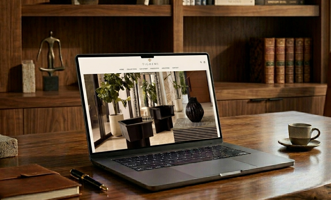
Tighemi is a Miami-based luxury home décor brand specializing in hand-sourced modern Moroccan pieces — pottery, furniture, and artisanal décor. Despite a compelling product offering and a growing social presence, their existing website was underperforming: slow to load, difficult to navigate on desktop, and failing to convert browsing visitors into buyers or inquiry leads.
The Brand Collective was engaged to conduct a comprehensive UX audit and develop a redesign strategy to align the digital experience with Tighemi's premium, curated brand identity and drive sales.
Role: UX/UI Design, User Research, Website Strategy
Duration: 3 Months
Tools: Figma, HotJar, Photoshop, Illustrator, SemRush, Google Analytics
Scope: Original Website Audit, Mockup Designs, Development, Web Maintenance
Agency: The Brand Collective
research
kick-off
To kick off the project, the team met with Tighemi's leadership to discuss expectations and priorities. Three immediate concerns emerged from that conversation:
Visitors were browsing the collections but not submitting inquiries and indicating a gap between discovery and conversion.
The website felt inconsistent with the in-store and social media experience. High-quality products were being presented on a technically underperforming platform.
An upcoming product expansion made a faster, more reliable site critical to support new inventory and potential press coverage.
The website lacked a checkout experience, creating a significant barrier to purchase. Customers interested in products had no direct path to complete a transaction online, limiting sales opportunities.
UX STRATEGY BLUEPRINT
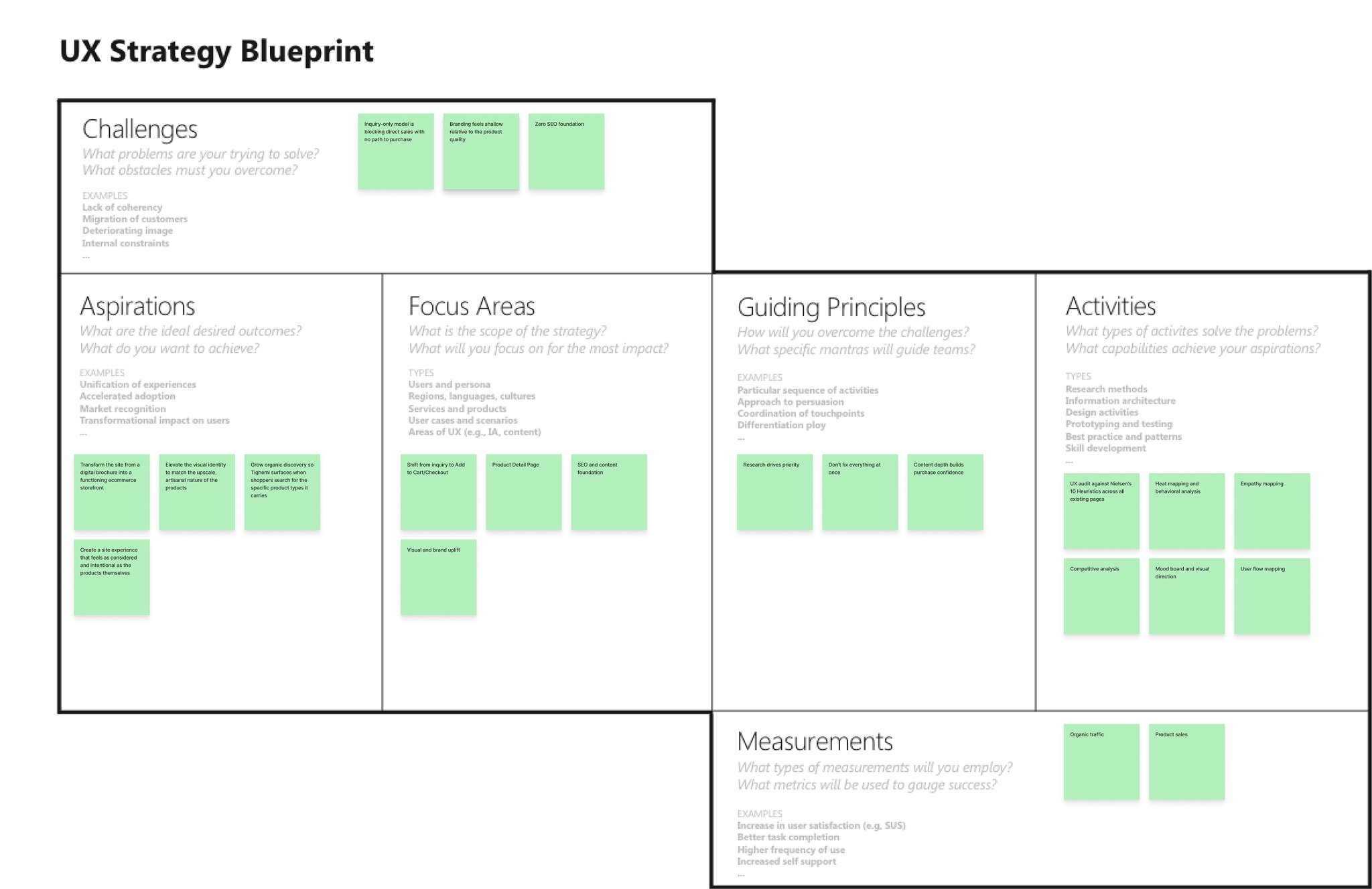
Before diving into any audit work, a UX Strategy Blueprint was established to frame the project scope, define success criteria, and align stakeholders on the approach. This ensured every subsequent decision, from heuristic findings to design recommendations, was tied back to a clear strategic goal.
EMPATHY MAP
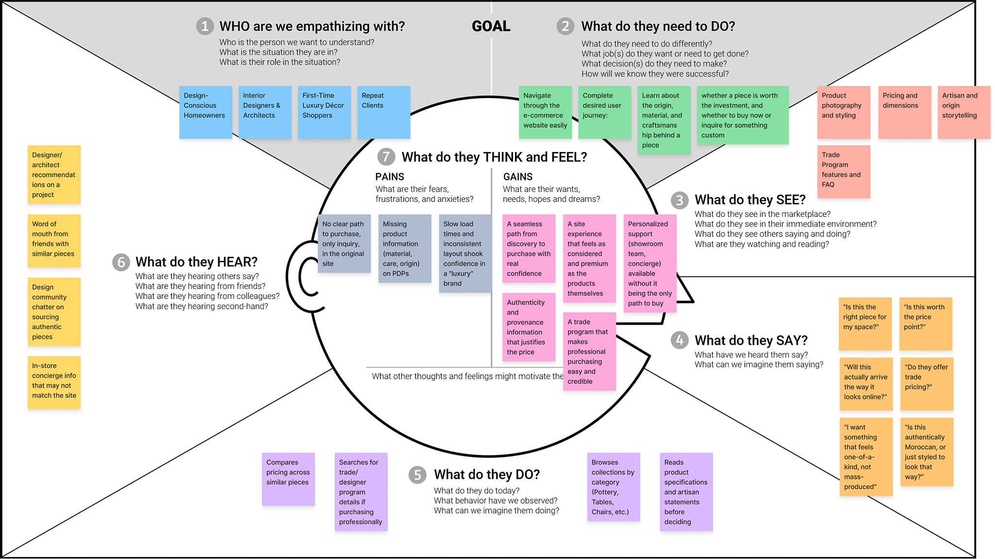
To ground the work in user perspective, the team conducted an empathy mapping session, stepping into the shoes of a Tighemi website visitor. Specifically, a design-conscious homeowner or interior designer browsing for one-of-a-kind artisanal pieces.
Behavioral Findings
In parallel with the heuristic audit, behavioral data was analyzed using HotJar to validate findings with actual user interaction patterns on the existing site. Key observations included:
Users clicked on collection category tiles at a high rate, confirming strong top-of-funnel interest. But drop-off spiked sharply on individual product detail pages.
The 'Contact Us' and 'Concierge' pathways received minimal clicks despite being the primary conversion action, suggesting the CTA was not visible or compelling enough.
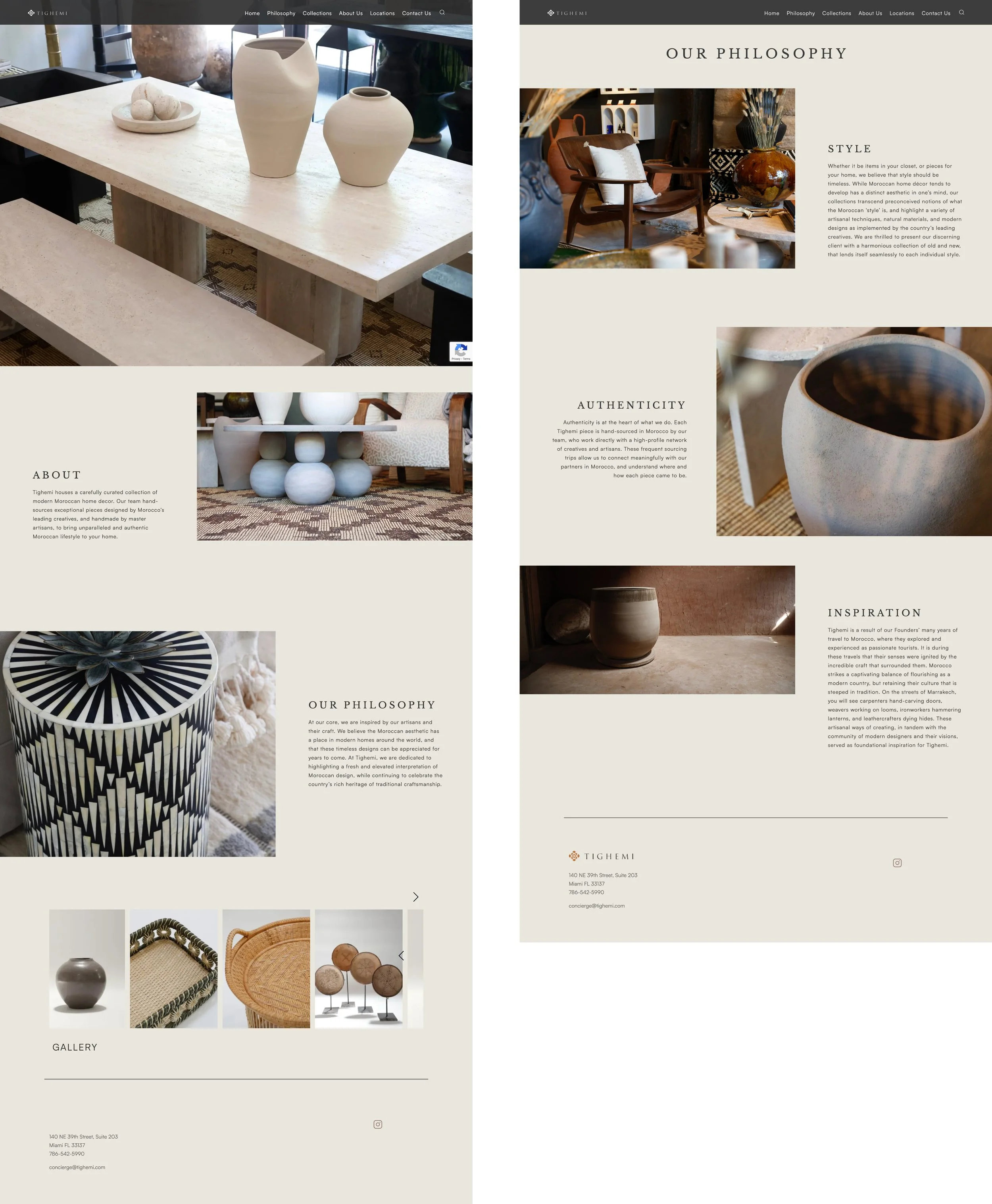
Scroll depth on the Philosophy and About pages was shallow — users were not reading the brand story content, likely due to dense text blocks and poor typographic hierarchy.
On mobile, the navigation collapsed inconsistently, causing some users to exit rather than explore further.
These findings confirmed the heuristic audit conclusions and added behavioral evidence to support the redesign prioritization decisions made in later phases.
Problem Statement
When exploring luxury artisanal home décor online, I want to feel confident about what I'm purchasing and how to acquire it, so that I can complete an inquiry or purchase without friction or uncertainty.
how might we
With the problem defined, the team reframed key challenges as design opportunities using the "How Might We" framework:
How might we surface pricing and product details earlier in the browsing journey to reduce hesitation at the product detail page?
How might we make the 'Buy' CTA feel more trustworthy and frictionless for high-consideration purchases?
How might we use brand storytelling, artisans, material sourcing, Moroccan craft heritage to increase confidence and time-on-site?
How might we improve the mobile navigation experience so users on smaller screens can browse as naturally as on desktop?
How might we grow organic discovery so Tighemi appears when shoppers search for the specific product types it carries?
How might we create a digital experience that reflects the quality and authenticity of Tighemi's products so that visitors feel inspired and confident enough to take the next step?
Heuristic Evaluation
The existing site was assessed against Nielsen's 10 Usability Heuristics. Findings were categorized as strengths (to preserve) and pain points (to address).
What Was Working:
Aesthetic and Minimalist Design: Color contrast legibility was strong. The warm neutral palette authentically communicated the brand's Moroccan craft identity.
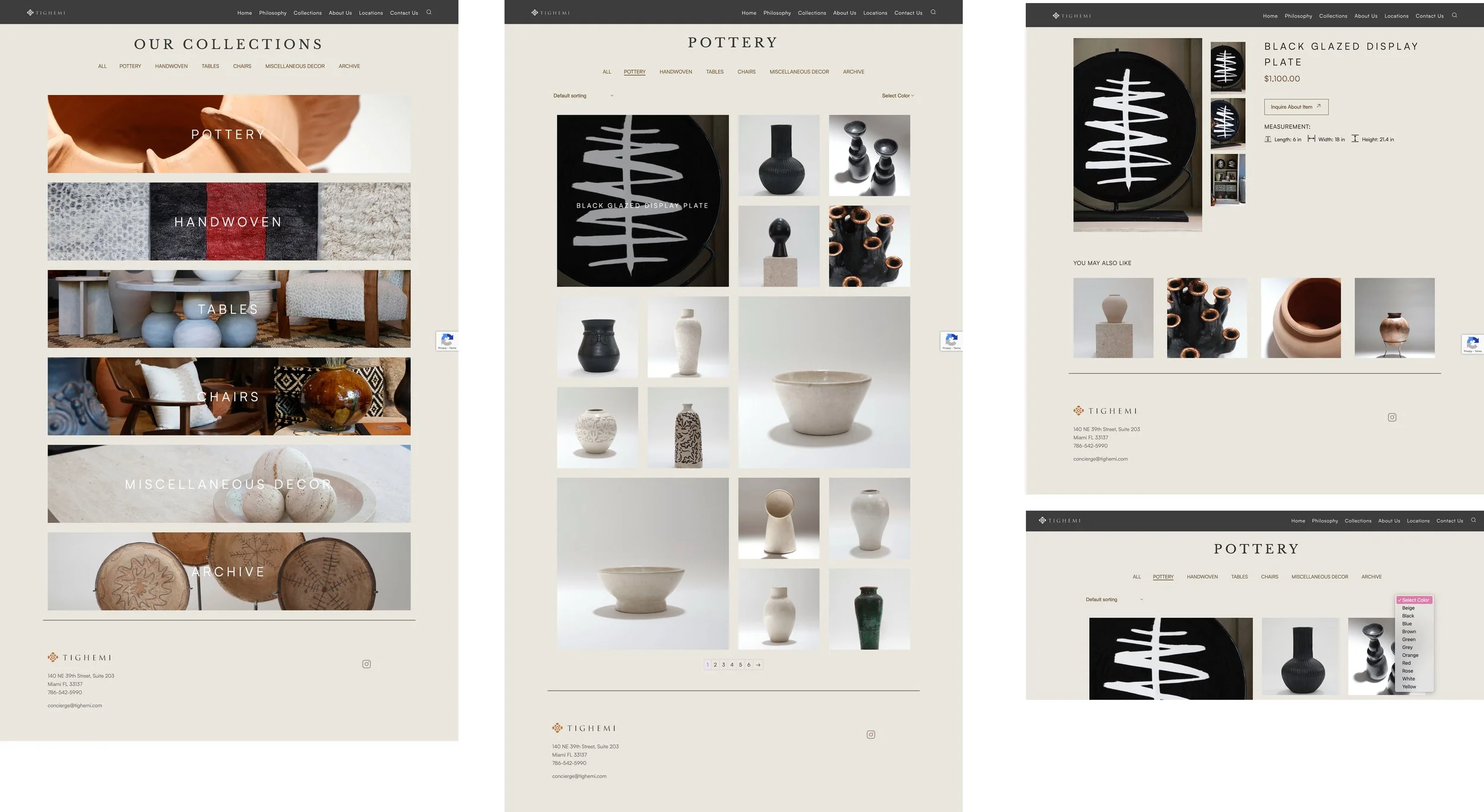
Navigation Consistency: Collection pages included a secondary filter menu (Pottery, Handwoven Tables, Chairs, Miscellaneous Decor, Archive). Helpful for direct category navigation without returning to the homepage.
Flexibility of Use: Some page interactions supported multiple navigation paths, accommodating both casual browsers and goal-directed visitors.
Critical Pain Points
No system status feedback: Buttons and CTAs gave no visual indication of interactivity — no hover states, no color change on click, no loading indicators.
Inconsistent layout standards: Asset sizes varied without a grid system, creating a visually disjointed experience across pages.
Accessibility gaps: Font sizes were fixed and did not adapt to user preferences or viewport changes.
Responsive design issues: The site appeared built for mobile and scaled up, resulting in awkward whitespace and misaligned sections on desktop.
Missing SEO foundations: All key pages (Home, Collections, Philosophy, About Us, Locations, Contact) had empty meta descriptions and no HTML heading structure.
Competitive analysis
Four brands operating in the artisan/luxury home décor space were analyzed. Two direct competitors were benchmarked in depth: Rumma Home and The New Rustic. Observations focused on homepage objectives, product detail page richness, navigation patterns, and conversion strategy.

Key takeaway: Tighemi had more backlinks than both competitors, yet significantly lower organic traffic than Rumma Home. Pointing to on-page content deficiencies rather than off-page authority as the limiting factor. Rumma Home's product pages were notably stronger: rich descriptions, dimension diagrams, finish selectors, bespoke customization flows, and cross-sell modules; all absent from Tighemi's existing pages.
Insights
Content & Journey Architecture
Heat mapping showed strong engagement through the homepage and into collections, but a clear drop-off on product pages. That made the PDP the priority for content, not a blanket fix across every page.
Category pages get short descriptions and item counts. The empathy map showed visitors wanted more confidence browsing, this gives them that without extra clicks.
Product pages get real copy: material, dimensions, care. This is the direct fix for the drop-off heat mapping flagged and the uncertainty the empathy map surfaced around "is this the right piece."
An "About This Piece" module gets added for artisan and origin info. Rumma Home's product pages did this well and outperformed Tighemi despite having a weaker backlink profile, so this was clearly a content gap, not an authority problem.
Proper headings and unique meta titles go in site-wide. The audit found a 7.11% text-to-HTML ratio and zero headings implemented, that's the most direct explanation for weak organic traffic relative to competitors.
Video and image compression happens in parallel. None of the above matters if the site still loads in 11 seconds.
Interaction & Journey Design
The audit and heat mapping pointed to the same issue from two angles: people were taking action, but the site gave them nothing back.
"Inquire About Item" gets real hover and active states. Heat mapping showed low engagement here despite strong browsing upstream, which lines up with the audit's finding that buttons gave no visual feedback at all.
Filter tabs get a clear selected state. Minor on its own, but it matches what the empathy map flagged as friction around feeling lost while browsing.
Product galleries get swipe and keyboard support. Heat mapping showed real mobile traffic, and the audit called out the site as mobile-first but poorly scaled, so this fixes the gap in both directions.
Nav links get hover and active-page indicators, so people know where they are as they go deeper into the site.
Ideation
user flow
Drop-off risk was highest at the product detail page, where a lack of information and a weak CTA caused visitors to exit rather than inquire. The Philosophy and About pages, while lower traffic, were identified as SEO and brand-confidence assets and included in the optimization scope.

A user flow chart was developed to map the 'happy path', the ideal journey from first arrival to completed inquiry and to identify the most likely drop-off points. This was used to determine which pages to prioritize in the design phase.
mscw method
After identifying the site's biggest usability and conversion issues, I used the MoSCoW framework to prioritize improvements and keep the project focused. The primary objective for this phase was to improve the overall user experience, address the key issues uncovered during research, and create a stronger foundation for e-commerce functionality.
Must Have
Clear hover and click states across all CTAs
Proper HTML heading hierarchy (H1–H6)
Optimized meta titles and descriptions
Fully responsive mobile layouts
Compressed and optimized imagery
Custom checkout experience
User accounts and purchase history
Live inventory tracking
Email Sign-up
Should Have
Detailed product copy on all product pages
Product pricing visible within collection pages
Email capture form above the footer
Cross-sell recommendations ("You May Also Like")
Keyword-optimized page content
Could Have
Expanded mega menu navigation
Product origin and artisan storytelling sections
Blog and editorial content
Homepage hero video
Wishlist or save-for-later functionality
Trade/designer program portal
Email flows (abandoned browse, post-inquiry follow-up) — automation/marketing ops territory, separate from this site redesign scope
Won't Have (This Phase)
Full blog/editorial section
Augmented reality product previews
Product customization
This prioritization helped ensure that the redesign focused on the highest-impact improvements first, while leaving room for future enhancements as the business evolved.
Design
Information architecture
The existing site structure was sound at the top level but lacked depth. Recommended IA improvements included:
Proper HTML heading hierarchy (H1 per page, H2 for sections, H3 for subsections). Both for SEO and screen-reader accessibility.
Unique, keyword-rich meta titles and descriptions for every page, targeting non-branded search terms with purchase intent.
Descriptive product copy on all Product Detail Pages. Replacing image-only layouts with material details, provenance, and care instructions.
An 'About This Piece' module on PDPs surfacing artisan and origin information to support the brand's authenticity narrative.
interaction design recommendations
All CTAs ('Inquire About Item', 'Contact Us', 'Learn More') to receive hover, active, and focus states — color shift, subtle shadow, cursor pointer.
Collection filter tabs to show selected state with a clear visual treatment (underline or background highlight).
Product image gallery to support keyboard navigation and touch swipe on mobile.
Navigation links to include hover underline for discoverability; active page to be indicated with a persistent marker.
mood board
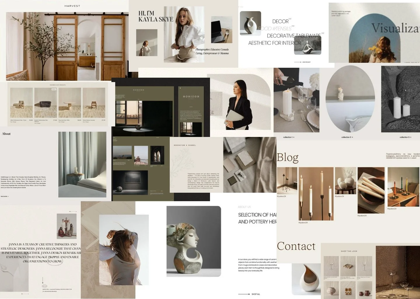
We created a mood board to set the direction for the brand uplift. Tighemi's branding felt shallow for a luxury Moroccan décor brand; the products were upscale, but the site didn't carry that same weight.
I pulled benchmark inspiration from brands like Harvest, Horizon, and a few other upscale furniture and pottery sites to see how they used type, color, and photography to read as premium without overdoing it. A few things stood out and shaped the direction:
A deep olive/charcoal was introduced as a secondary dark tone, similar to what Horizon used. Paired against Tighemi's existing cream, it gives the site more range without losing the warm neutral base.
Typography moved toward pairing a serif display headline with a clean sans body, closer to how Harvest and the pottery sites presented their About and product copy. This is a slight upgrade, not a full rebrand.
Lifestyle photography (candles, table settings, hands interacting with the product) got pulled in as a reference for how to shoot and crop Tighemi's own product photography going forward, so pieces feel placed in a life, not just floating on white.
This mood board became the reference point for every high-fidelity decision after, keeping the question "does this feel like an upscale brand" in view the whole way through.
High-fidelity
DESIGN DIRECTION
The high-fidelity direction reflects the mood board, the research findings, and the shift to e-commerce coming together into one cohesive design. Deeper olive tone, image overlaps, and serif/sans type pairing established in the mood board carried through every page. The product detail page in particular was rebuilt around Add to Cart and checkout instead of a single inquiry link, since that was identified as the highest-priority gap from the heat mapping data.
Homepage
The hero leads with a framed lifestyle image, giving the website an approachable feel from the jump. Featured Products now sits on the deep olive background, giving the site the secondary dark tone it was missing, and showing price directly in the grid so browsing feels like shopping, not just looking. The Shop the Look module pairs a lifestyle photo with four shoppable pieces, which is the clearest example of the ecommerce shift; the homepage was rebuilt to sell rather than just inspire. Our Story and Philosophy are also split into two distinct nav items, since the original site collapsed brand story and brand values into one shallow page.
collections & shop pages
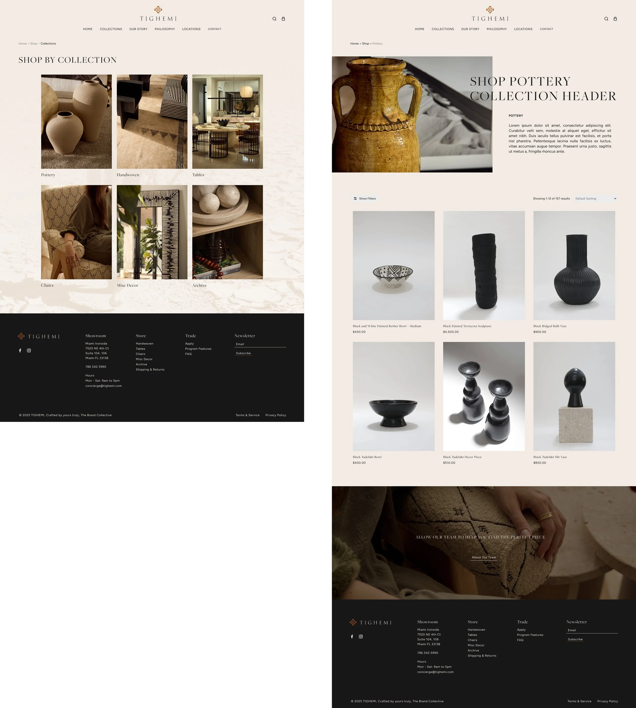
The collection page was restructured to six category tiles that are now consistent in size and cropping, replacing the inconsistent masonry layout from the original site. Labels sit below each image instead of being overlaid, fixing the legibility issue flagged in the original audit.
The shop grid moved to a clean, consistent layout with price shown under every product, directly responding to the original audit finding that pricing required a click to discover. Show Filters and Default Sorting are now clearly visible controls instead of the small, easy to miss versions on the original site, and the result count replaces the page-number-only pagination that gave no sense of browsing depth. The banner at the bottom keeps the team accessible for shoppers who want guidance, without it being the only path forward.
Product Detail Page
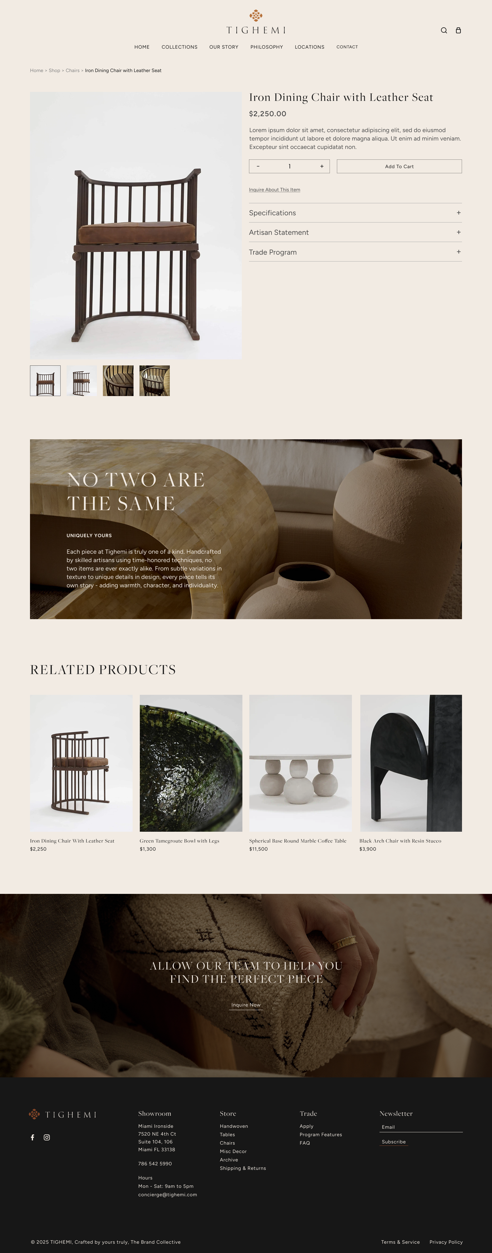
This is the page that shows the e-commerce shift most clearly. Add to Cart is the primary action with a quantity selector built in, and Inquire About This Item sits underneath as a secondary link for bespoke or trade interest, the inverse of the original page where inquiry was the only option. Specifications, Artisan Statement, and Trade Program are organized into expandable sections, giving the page real content depth without walls of text. This is the direct fix for the empty PDP flagged in the original audit. The "No Two Are The Same" banner reinforces the handmade, one of a kind positioning the empathy map showed visitors needed to feel confident purchasing a piece like this online.
Our Story Page
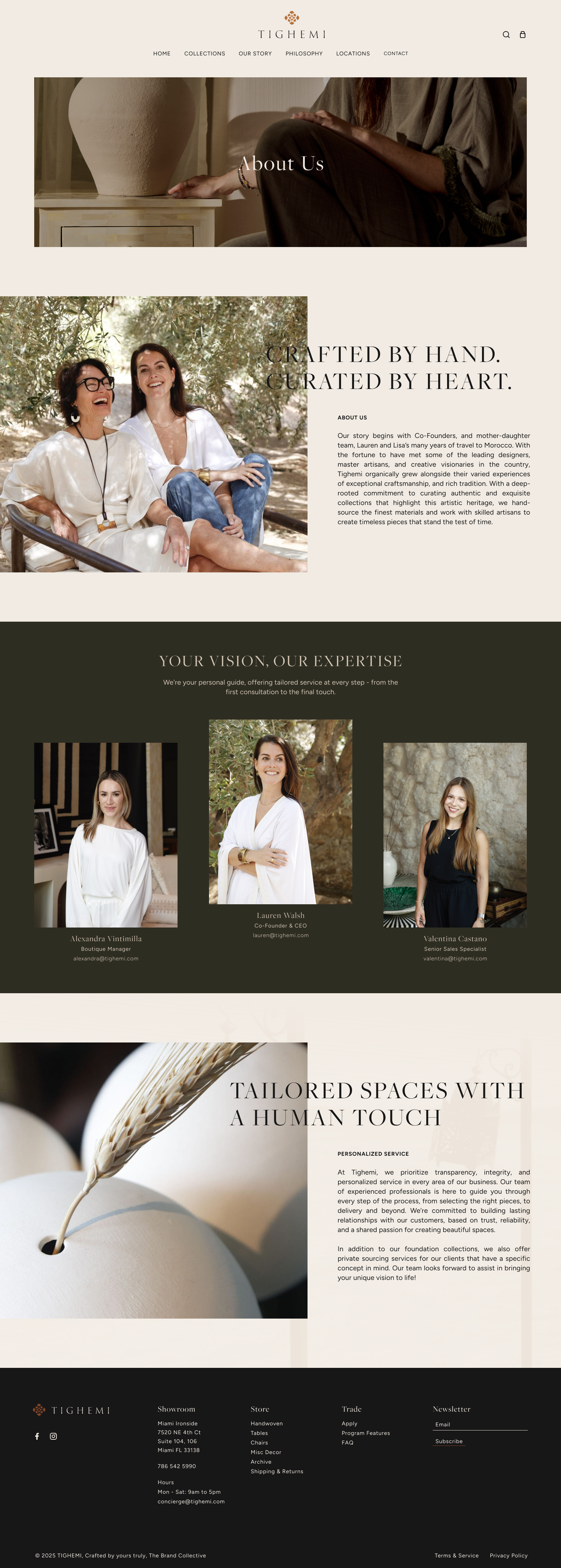
This page absorbs what used to be a single shallow About page and turns it into both a brand story and a trust building tool. The founder story (Lauren and Lisa, mother daughter Co-Founders) gives the authenticity narrative a face, while the team section introduces the people a visitor would actually work with, which matters now that the brand offers a trade program and private sourcing. The personalized service section closes the gap the original site had, it gave visitors no reason to trust the brand beyond product photography. Now there's a clear path from "this is who made it" to "this is who will help you."
trade program
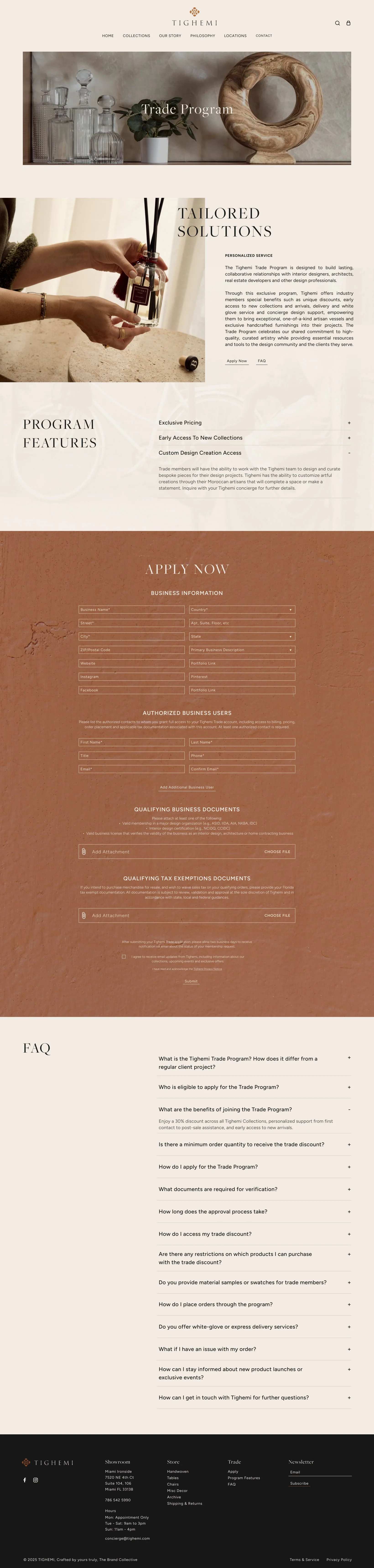
This page got pulled forward in priority because holding off on it would have meant sitting on a sales channel that was already viable. Tighemi's products and showroom experience were clearly built for a designer or architect audience; the trade discount, custom design access, and white glove service were all things the brand could already deliver, the site just had nowhere to put them. Waiting to build this page would have meant turning away ready buyers while other phases caught up.
results
traffic growth
Before the redesign, Tighemi was averaging 35 organic sessions per month, a number suppressed by missing metadata, zero implemented headings, and a 7.11% text-to-HTML ratio. Organic traffic grew to 400+ sessions/month within the first 6 months post-launch, more than 10x the pre-2025 baseline.]
seo & organic traffic
Complete on-page SEO across all pages within 30 days of launch
Organic traffic target: 100+ sessions/month within 90 days; 350+ within 6 months
Page 1 rankings for at least 5 non-branded product keywords within 6 months
Text-to-HTML ratio improved from 7.11% to 20%+
user experience
All primary CTAs verified with hover, active, and focus states across browsers
Consistent grid layout applied across all collection and product pages
Zero critical heuristic violations in follow-up audit post-launch
Mobile experience validated across iOS and Android at 375px, 390px, and 430px breakpoints
sales & conversion
Product sales grew 4x within an 18-month period following the e-commerce launch, validating the decision to prioritize checkout over the original inquiry-only model
The Trade Program page converted a previously dormant audience (designers, architects) into an active sales channel, one that had no dedicated entry point on the original site
takeaways
The biggest shift in this project wasn't visual, it was structural. Moving Tighemi from an inquiry-only site to full ecommerce was the single highest-leverage decision, and the heat mapping data made that case clearly: visitors were engaging all the way through product pages and then had no way to actually buy. Everything else, the mood board direction, the SEO fixes, the interaction polish, mattered, but none of it would have moved sales the way the e-commerce shift did.
Prioritizing the Trade Program page ahead of schedule followed the same logic. Tighemi already had the offering, white glove service, trade discounts, custom design access, it just had nowhere to live. Holding that page for a later phase would have meant turning away a ready B2B audience while other lower-impact work caught up.