The Sacred Space
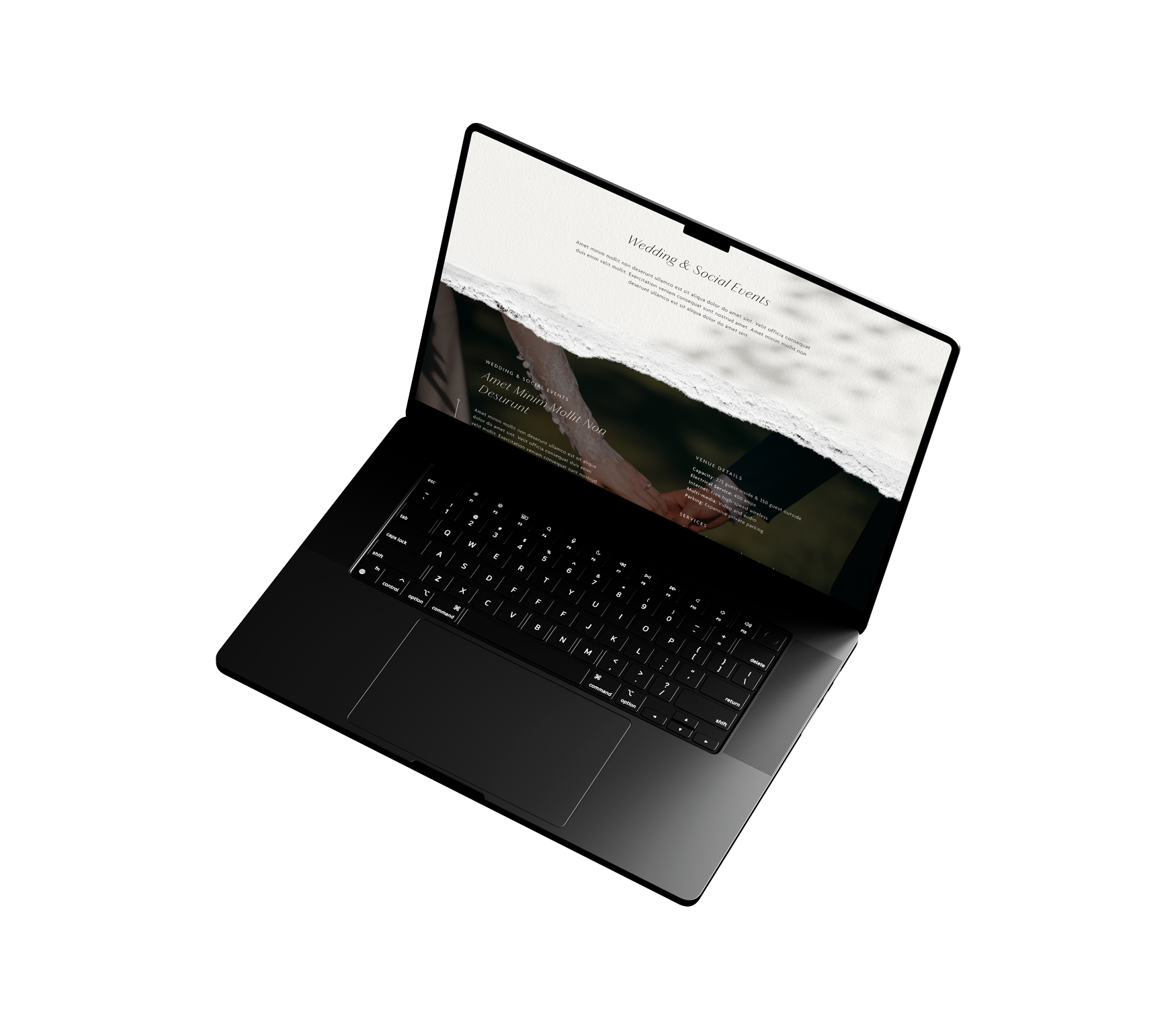
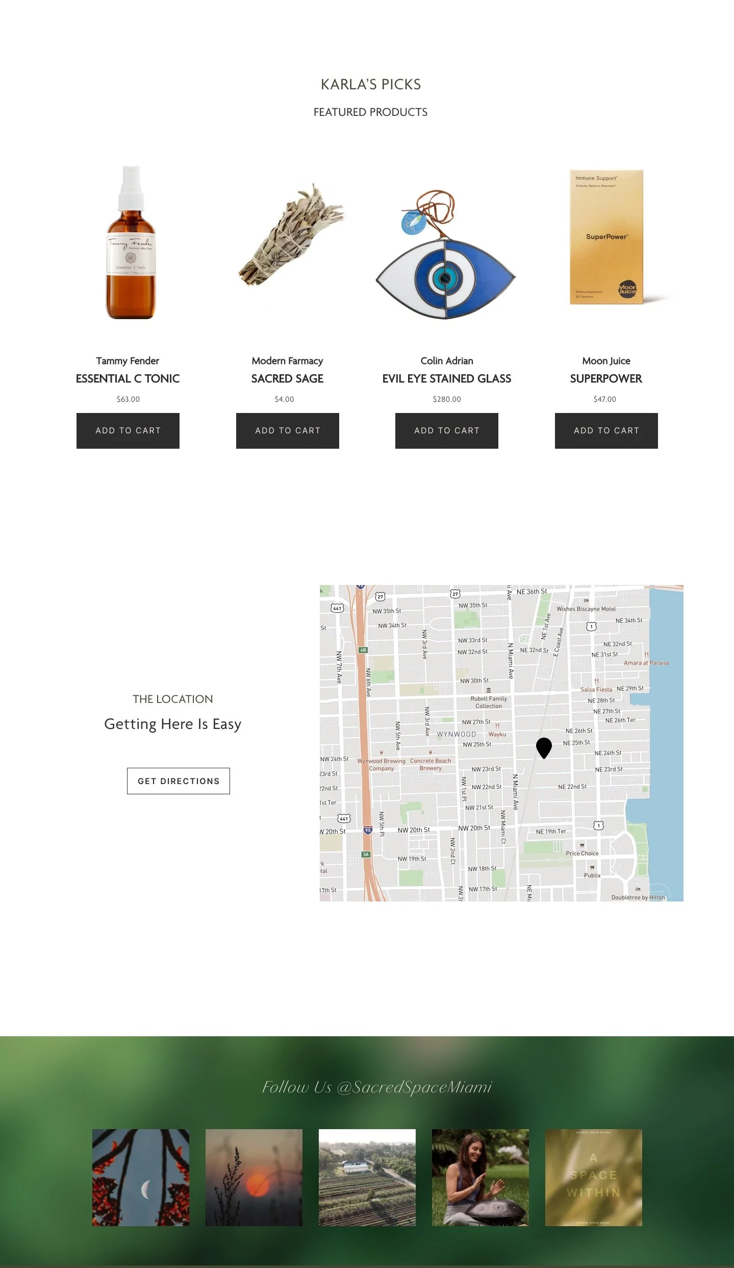
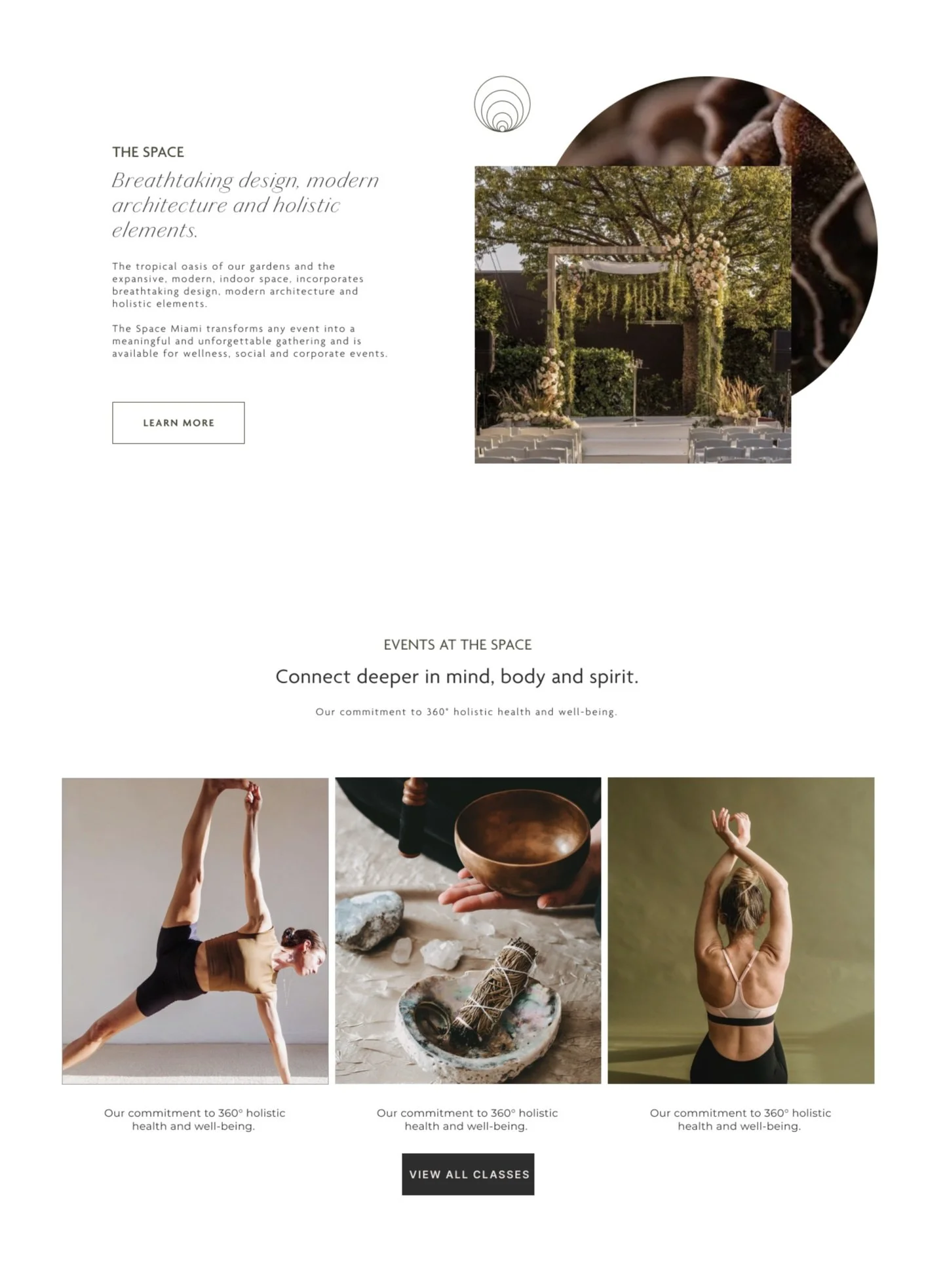
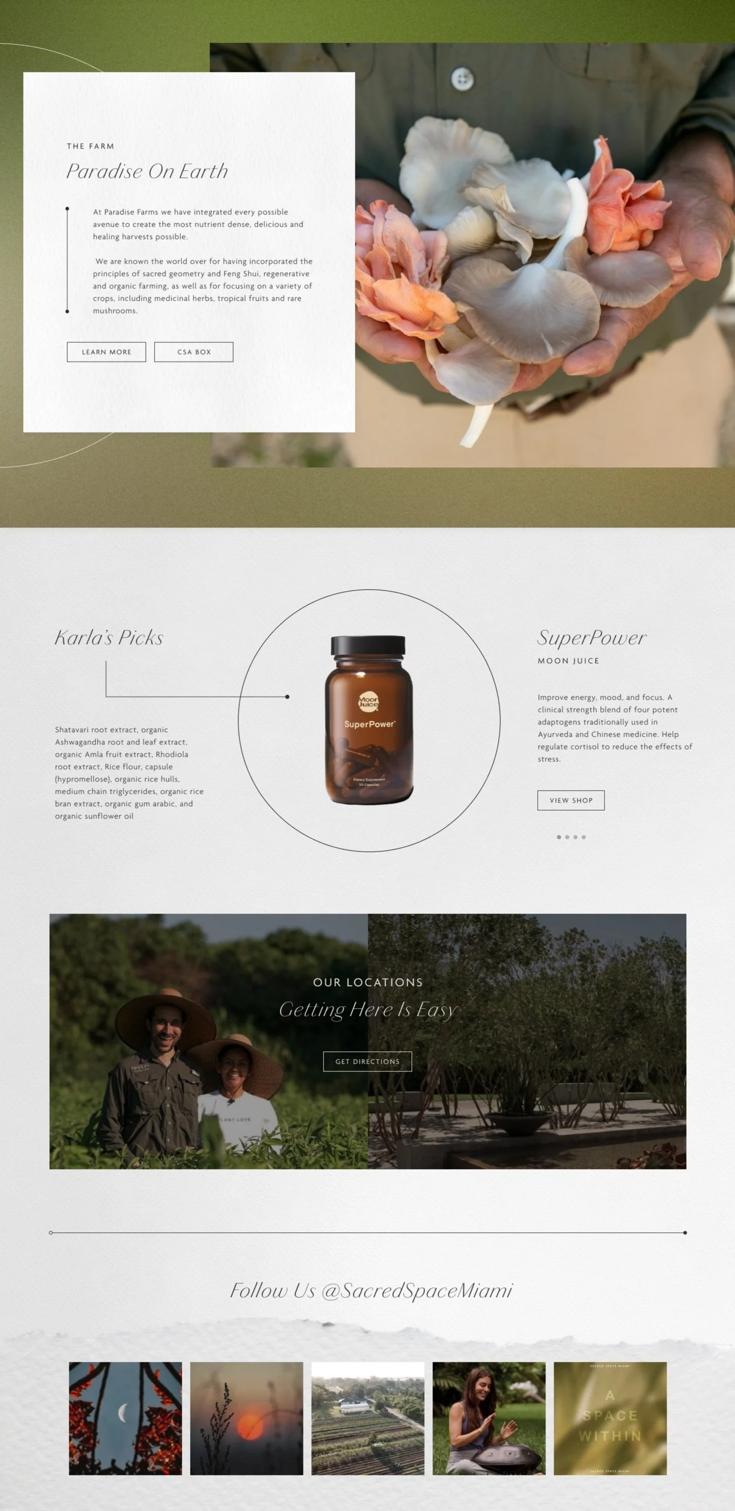
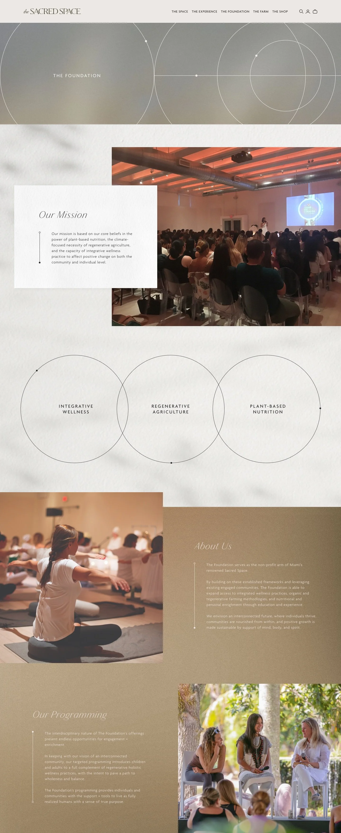
The Sacred Space Miami encompasses three distinct branches: The Sacred Space, Paradise Farms, and Modern Farmacy. I joined this project midway and was tasked with transforming existing wireframes into high-fidelity mockups while overseeing the development phase. The design for the multi-site experience received recognition as an Honoree by The Webby Awards for Health & Wellness, Web & Mobile Sites.
Role: UX/UI Design
Duration: 4 Weeks
Tools: Figma, Photoshop, Illustrator
Scope: 14 High-Fidelity Mockups
Agency: The Brand Collective
Credits: Art Director & Illustrator - Miguel Camacho, Art Director - Mariana Fuguet, Wilson Hernandez - Web Coding, David Holbrock - Web Coding
Kick-off
One of my first projects as a UX/UI Digital Designer at The Brand Collective was jumping in mid-project to design high-fidelity mockups for the already completed wireframes. Before diving into the design work, I prioritized thoroughly understanding the wireframes and engaging in detailed discussions with the branding team. These conversations were crucial for aligning on how design assets should be used moving forward.
These initial conversations gave me valuable insights that helped shape my approach. The team provided me with benchmarks the client wanted the website's feel to be based on, giving me a clear direction. These discussions ensured that my designs would look great and align with the client's vision and brand guidelines.
THE SACRED SPACE
HIGH-FIDELITY MOCKUP V1
To manage the timeline efficiently, I decided to focus on designing the homepage first. After completing it, I planned to meet with the client to gather their feedback before moving on to the next pages. This approach ensured that any necessary adjustments could be made early on, keeping the project on track and aligned with the client's vision.
ITERATIONS
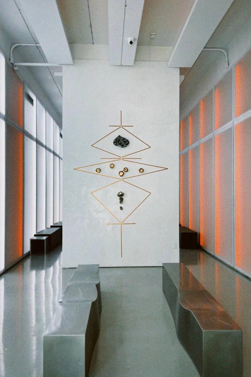
Going into the meeting, I felt confident that I had nailed the design. However, the outcome didn’t go exactly as planned. Despite this, we gained invaluable insights from the client. They pointed out sections they liked and provided critical feedback, highlighting that "the website needed to feel like an extension of the physical location and have a more grounded feel." To truly capture the essence of the space, we coordinated a visit to the location. This allowed us to better understand the atmosphere and draw inspiration directly from the physical environment, ensuring our digital design would reflect the same ambiance and grounded experience.
HIGH-FIDELITY MOCKUP V2
After our visit, I updated the homepage mockup by incorporating textures and materials from the physical location to create a stronger sense of connection. I made sure to integrate these elements without compromising the user flow that had already been established. Additionally, I refined certain sections to better match the ambiance of the physical space, ensuring the digital experience felt like a true extension of the brand’s environment. This approach maintained the functionality and user journey while enhancing the overall look and feel of the wireframe.
High-fidelity mockup v3
Going into the meeting, I felt confident I had nailed the design. However, the meeting didn’t go quite as planned. Despite this, we gained valuable insights from the client. They highlighted specific sections they liked, which was encouraging. More importantly, they provided crucial feedback, emphasizing that the website needed to feel like an extension of its physical location and have a more grounded, authentic vibe. This feedback was instrumental in refining our approach and ensuring the final design truly reflected their brand’s essence.
Final High-fidelity mockup
After our final meeting with the client, we made the necessary updates to the additional pages based on their feedback. We fine-tuned the design details to make sure each page looked cohesive and met their expectations. Once the design was solidified, we focused on content planning. Working closely with the client, we figured out the best way to fill the pages with engaging and relevant content that would resonate with their audience. This included selecting imagery, writing copy, and organizing information to enhance the user experience while conveying the unique story and essence of the Sacred Space.
paradise farms
For Paradise Farms, the focus was on creating a landing page and a product detail page for their subscription boxes. I started by designing the initial concepts that captured their brand essence. After presenting the first draft, we had a feedback session with the client. This was super helpful in understanding what they loved and what needed tweaking. I then made the necessary revisions based on their input. The process included just one round of revisions, which kept things efficient but still allowed us to fine-tune the designs.
MODERN FARMACY
When I began designing for Modern Farmacy, the client informed us that their physical shop was temporarily closed. They needed a way to showcase their digital presence and collections. I focused on creating a straightforward design that effectively communicated their brand online.
I made sure to follow the brand guidelines closely, ensuring consistency and a cohesive look. Drawing from the structure of The Sacred Space site, I crafted a design that was both elegant and functional. This helped create a seamless experience for users navigating between the different branches of the company. By concentrating on these two key pages, we managed to highlight Modern Farmacy's offerings in a visually appealing and user-friendly manner, keeping the digital experience engaging despite the physical store being unavailable.
results
Takeways
Diving into a project that was already in motion without prior background knowledge was initially quite challenging, but it provided me with several key takeaways:
Adaptability was crucial as I learned to adjust to the client's evolving needs and feedback throughout the design process. Understanding that not every project starts where you expect it to, but rather where it's needed most, underscored the importance of resourcefulness.
Effective communication with developers ensured that designs were implemented as envisioned. Regular check-ins and meticulous feedback documentation ensured we stayed on track and met project milestones.
Client interactions emphasized the importance of justifying design decisions and ensuring they aligned with project objectives and user expectations.
Maintaining brand consistency across three unique sub-brands was a significant challenge. Establishing a robust design system and meticulously organizing references were key to achieving cohesive brand implementations.
Given the opportunity to expand on this project, I'd be excited to delve deeper into refining Modern Farmacy and Paradise Farms. Bringing their digital experiences up to par with The Sacred Space's page would really elevate the overall user journey, ensuring a seamless and immersive experience across all brand platforms.

