Headspace
Headspace is an app designed to help people meditate and teach life-changing mindfulness skills in just a few minutes daily. While at Ironhack, I was tasked with adding a feature to Headspace to address a common issue of users not knowing how much time has passed during their meditation.
Role: UX/UI Design, User Research
Duration: 1 Week
Tools: Figma, Otter.ai, Useberry, Google Surveys, Procreate
Bootcamp: IronHack

The Problem
“Headspace needs a way to let its users know when a certain time has passed without looking at their phones.”
the solution
By adding extra settings for the media player, users can personalize their meditation experience to indicate the time passed.
research
surveys
I began by filling out my survey canvas to get a clearer picture of who I was trying to target, what I was trying to get out of the survey, and what key questions to ask to get the best results possible.
Two screener questions I asked to ensure that I was targeting the right audience were, “Are you someone who practices some sort of meditation?” and “Have you used Headspace?”
I focused on questions regarding users' preferences when meditating and validating whether the feature I was looking to implement would be a good option.
85.7% of users do not look at their phone when meditating
57.1% of consumers would like a more personalized meditation session
71.4% of consumers said a periodic sound queue would improve their meditation experience instead of looking at their phone
Interview
To better understand why people meditate and whether Headspace would benefit from the new feature I was tasked with implementing, I interviewed Daniella Alzamora, one of our survey participants. Daniella, currently completing her master's degree in Ayurveda & Integrative Medicine, practices meditation daily as part of her studies. She provided invaluable insights that helped shape my approach to the project.
“During mindfulness meditation, being aware of the time is okay. So any subtle sound that could possibly not break your concentration but would not be a bad idea.”
- Daniella Alzamora
COMPETITIVE ANALYSIS
While waiting for my survey results, I went ahead and tried to learn more about Headspace and its competitors.
A quick summary I stumbled upon about Headspace helped put me in the company’s shoes when it came to focusing on its goals.
Meditation has been shown to help people stress less, focus more, and sleep better. Headspace is meditation made simple, teaching life-changing mindfulness skills in just a few minutes daily. How it works. Find some headspace. Care for your mental health in three minutes a day.
Apart from learning about Headspace, it was important to learn about existing applications that directly compete with it. I filled out a Competitive Analysis Chart describing everything I found about the competing applications—the good, the bad, and the similar—to see how I can take advantage of the compared features in my addition.

problem statement
When using the Headspace application for meditations, users want to have the ability to personalize their experience with the help of a straightforward settings page to allow them to do so.
hOW MIGHT WE
With my research and competitive analysis done, I began formulating “How Might We” statements and stuck to one that I could remember and stay true to when creating a solution.
How might we improve the settings page in the media player to let users personalize their meditation?
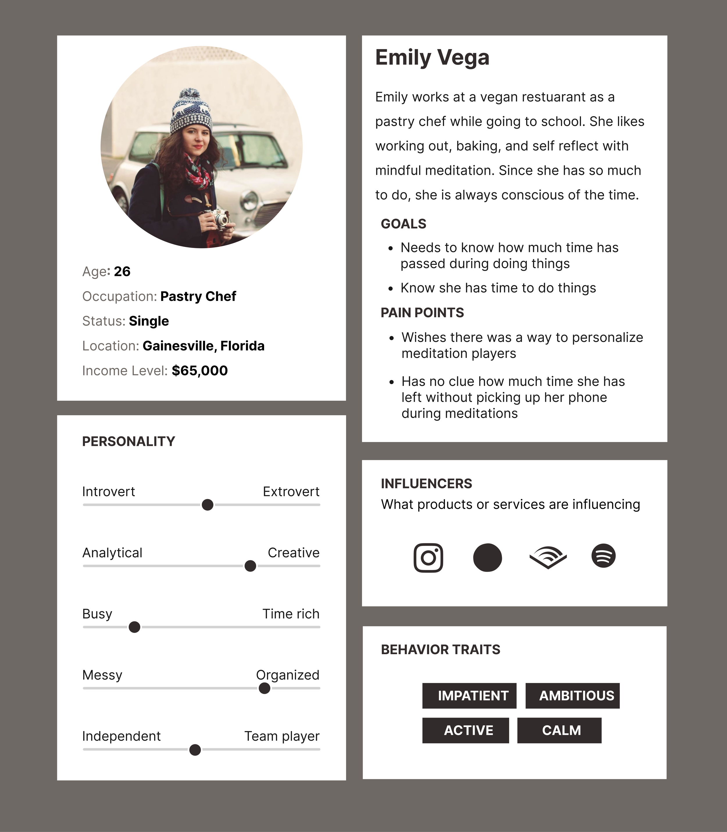
user persona & journey
user persona
Based on my research, I created the primary user who highlighted the pain points and goals we learned. My persona was used throughout the ideating process to create a product that solved their pain points and met their goals.
User journey
To find the areas for opportunity, I created a user journey map where I observed Emily go through her meditation process with Headspace. Because of the workarounds she has to go through, she usually ends her meditations annoyed, less motivated for the next sessions, and not as clear in her mind as she’d like to be. The biggest pain point I observed during the Journey Map was during the meditation when she had to stop to turn off any sound queue she had turned on away from the application. This further solidifies the need for the feature requested to be implemented.

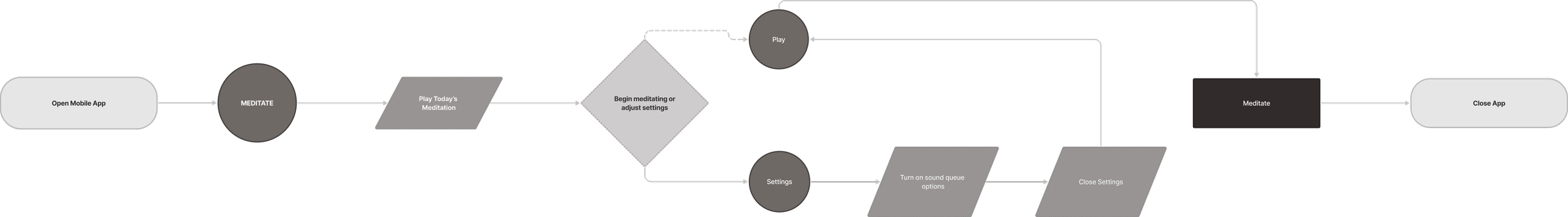
User journey
A user flow chart was ideal for visualizing the steps needed for the user to complete the task of adding a sound queue.
Where it explains that the user would:
1. Open the Headspace application
2. Select the meditation section
3. Play Today’s Meditation
4. Either choose to press play or go to the settings section
5. If they took the direction of the settings, they would turn on the sound queues option
6. Close the settings tab
7. Press play and meditate
8. Once the user is done, they would close the app and continue their day.
Low-fidelity
When drawing my ideas for the feature addition, it was important to keep still the entire user flow in mind, even if the only thing being changed was the settings. Being able to draw and visualize how Headspace designed the layout helped me keep the integrity of the brand with my redesign.
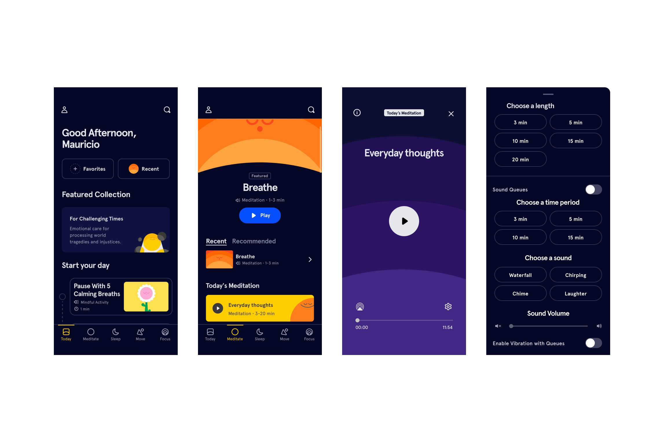
I added a "Sound Queue" section on the updated settings page that could be turned off with a toggle. In this section, you can pick the frequency of the sound queue, the kind of sound you would like to be notified with, the sound volume, and whether you want your phone to vibrate with the sound.

Mid-fidelity
For Mid-Fidelity, I focused on the media player and the settings page. The media player page was not changed because the settings page is a drag-up page that would scroll over it. The sounds chosen were based on preferences given by user feedback. It was essential to select sounds that would not break a user’s concentration but subtly inform them of the time passed.
I created the components that would be used for the buttons, sliders, and toggle switches.

Usability Testing
The Mid-Fidelity was used to conduct a usability test to see how intuitive the setting process would be for its users. The participants were surveyors who answered “yes” to using Headspace.
From the 7 users tested:
100% Completion of the task
The average time spent completing the task was 22.7 seconds
Users said they liked the options and how easy it was to set them up.
Style Guide
The style guide below showcases the styling elements and components already living within the Squarespace ecosystem to ensure brand consistency and efficient integration.

High-fidelity
After finishing the style guide, I updated the previous wireframes to a high-fidelity prototype. To keep it as close to the application as possible, I kept the interactions consistent with what Headspace offers.
→ Interact With Prototype
results
Takeways
Some takeaways and learnings that I got throughout this week were:
Do everything. I had to do all the research, conduct the interview, design, and present the functionality and process independently. The practice and implementation of these methods were all important for the overall growth of this career.
Organization is key. Making all the components before starting the prototyping was crucial to keeping everything working properly and making the work process as easy and simple as possible.
If I were to continue working on this project, I would continue to work on the functionality of the feature by testing the settings with the audio being heard, learning which sounds would be best, and exploring other personalization options that could be utilized during other meditation types.