Neodermis Factor
Neodermis Factor is a revolutionary skincare brand aimed at tackling various skin issues and enhancing skin wellness. Developed through research and innovation, it harnesses advanced ingredients and formulations to address concerns like aging, pigmentation, acne, and hydration.
The scope of work for Neodermis Factor involved rebranding the website to align with new brand guidelines while enhancing the existing user experience. As well as ha’. As well as have the design implemented on their Shopify storefront.
Role: UX/UI Design, User Research, Project Manager
Duration: 4 Weeks
Tools: Figma, HotJar, Photoshop, Illustrator
Scope: 6 Mid-Fidelity Wireframes, 4 High-Fidelity Mockups
Agency: The Brand Collective
Credits: Art Director - Mariana Fuguet, Marketing Specialist - Sheila Salgado, Illustrator - Miguel Camacho
research
kick-off
To kick off the project, my team and I met with the CEO of Neodermis to discuss their expectations and needs. During our conversation, she mentioned an upcoming press launch for new products and emphasized the importance of aligning the website with the rebrand and having a fully functional e-commerce site ready in 4 weeks. She also pointed out that many users were dropping off before completing their purchases, giving us crucial insights to address.
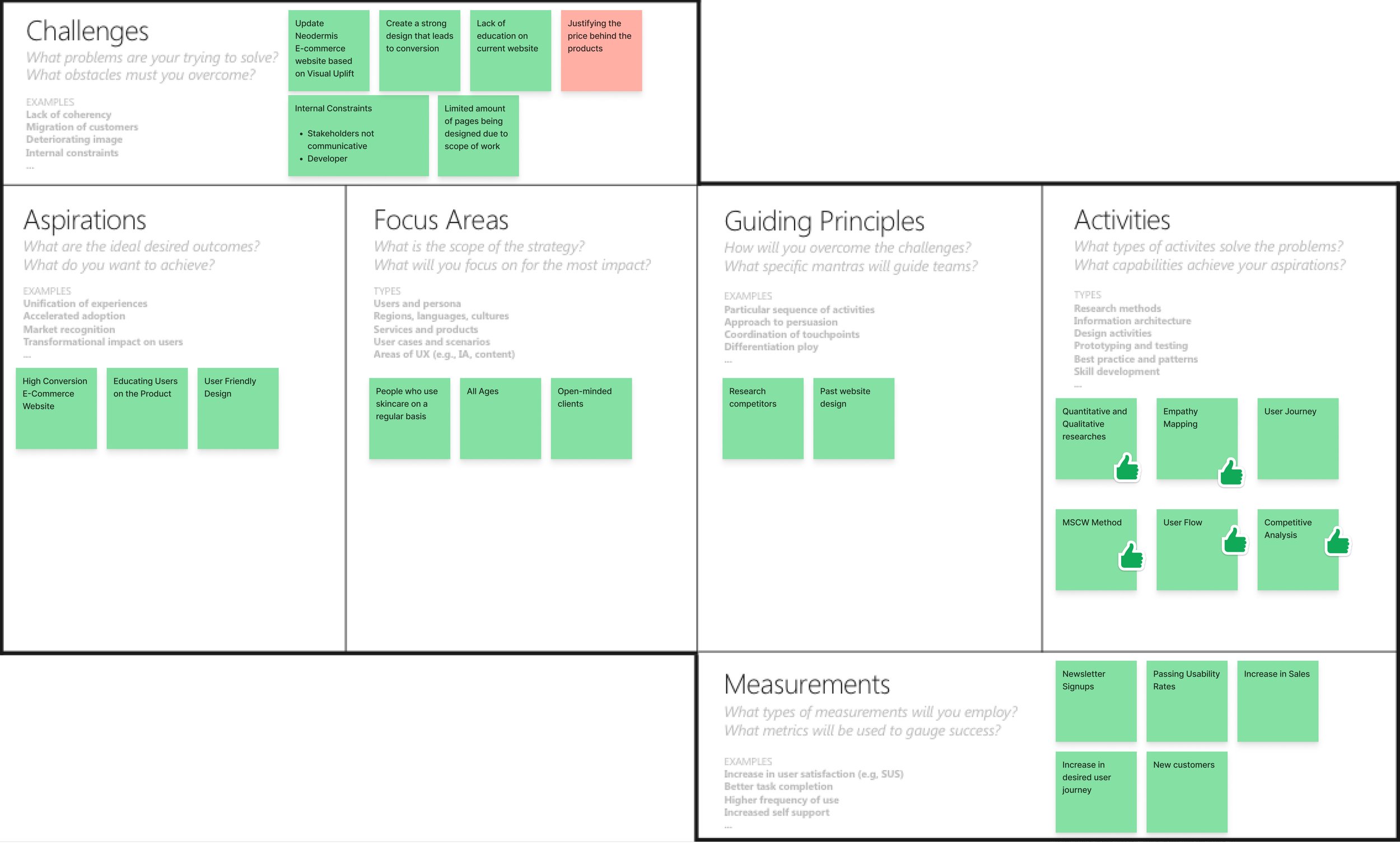
UX STRATEGY BLUEPRINT
I felt it was necessary to start off by completing the UX Strategy Blueprint, ensuring I had a clear plan to tackle this sprint effectively. Having a solid game plan in place allowed me to navigate the project with confidence and assess its success along the way.
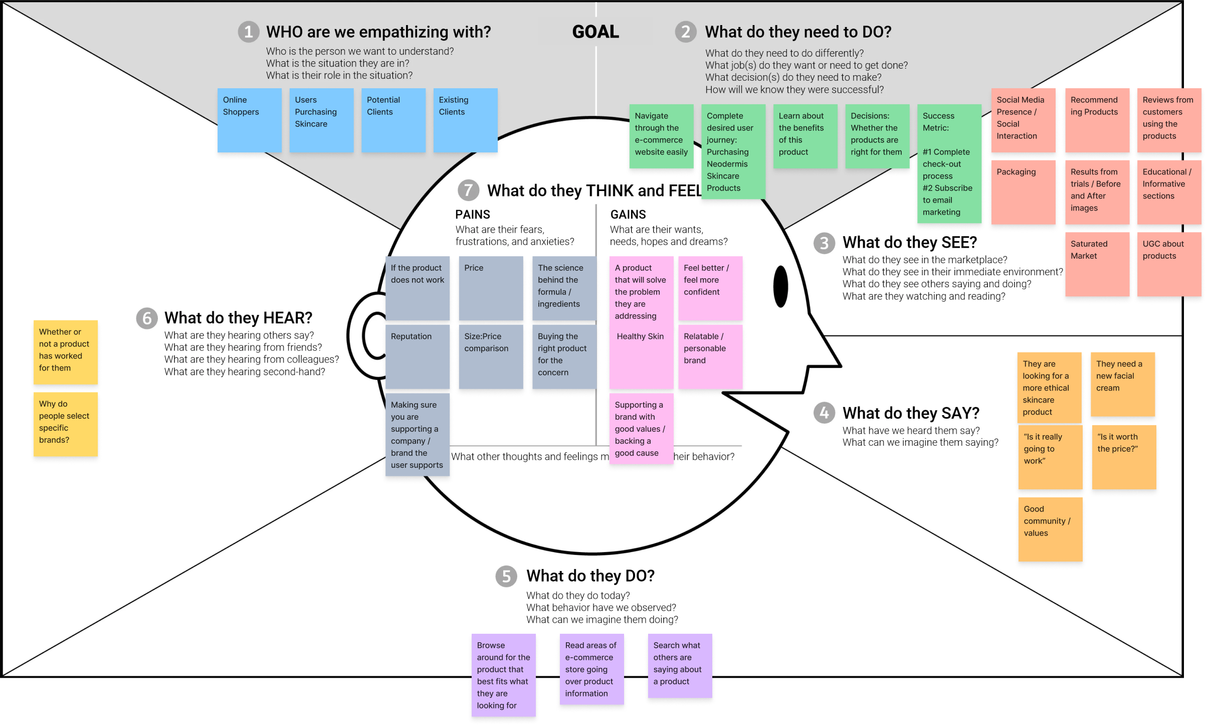
EMPATHY MAP
It was crucial to gain a deep understanding of our target users for this project. To achieve this, I assembled a team of four members from the agency and immersed ourselves in the perspective of skincare shoppers. Throughout this session, we brainstormed ideas to identify their pain points and find their desired outcomes.
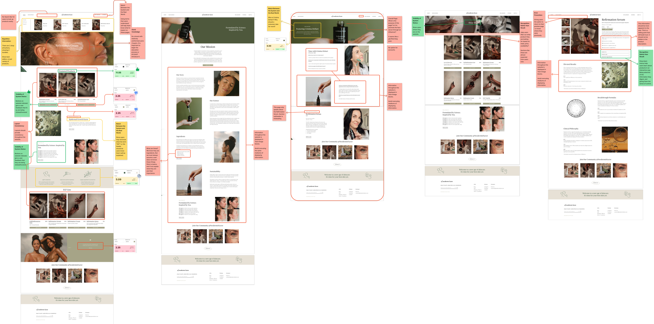
ux website audit
Apart from understanding the user's needs, it was essential to grasp why the current website design fell short. I conducted a usability audit, assessing elements like the 10 usability heuristics, color contrast legibility, and information architecture. My main takeaway was that although the website offered information, it felt scattered and lacked depth. Given the industry's emphasis on providing consumers with comprehensive product information, I recognized the importance of addressing this issue.
HEAT MAPPING
After completing the audit, I proceeded to run a heatmap analysis on the previous website. The results, which I obtained immediately after the audit, validated my earlier findings and felt like a breakthrough moment. Users were drawn to informational sections, with the "Our Science" page emerging as one of the most clicked pages, along with reviews. This reaffirmed that consumers were keen to learn about Neodermis Factor and read others' experiences with the product.
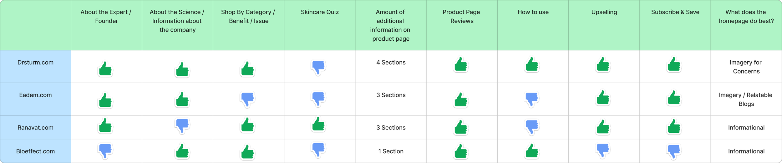
COMPETITIVE ANALYSIS
I conducted a comprehensive competitive analysis on four key competitors, examining the information displayed on their websites and identifying any unique features they offered. I closely observed the objectives of their homepages to gain insights into their overall strategies and approaches. While each website had its own unique behavior, it was incredibly insightful to observe the commonalities in the information they chose to display and visually identify where they aligned.
RESEARCH INSIGHTS
I found that the UX Audit and Heat Mapping were particularly enlightening, while exercises like empathy mapping and competitive analysis provided valuable context.
Here are the key takeaways:
Users are hungry for detailed information about the product, wanting to understand its functionality and benefits thoroughly.
It's essential not just to provide a lot of information but to ensure it's meaningful and seamlessly integrated into the user experience.
PROBLEM STATEMENT
After reviewing the research results I created my problem statement:
When looking to purchase skincare products, I want to be able to make an informative decision on whether a product is right for me.
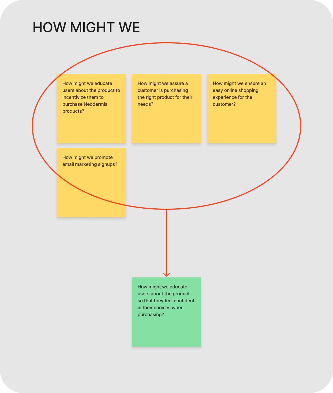
hOW MIGHT WE
During this exercise, I formulated several "how might we" questions:
How might we educate users about the product to incentivize them to purchase the products?
How might we assure a customer is purchasing the right product for their needs?
How might we ensure an easy online shopping experience for the customer?
How might we promote email marketing signups?
After thorough consideration, I honed in on an all-encompassing "how might we" question:
How might we educate users about the product so that they feel confident in their choices when purchasing?
Ideation
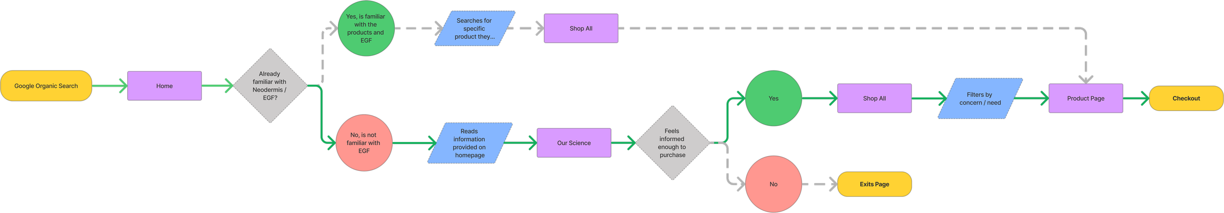
user flow
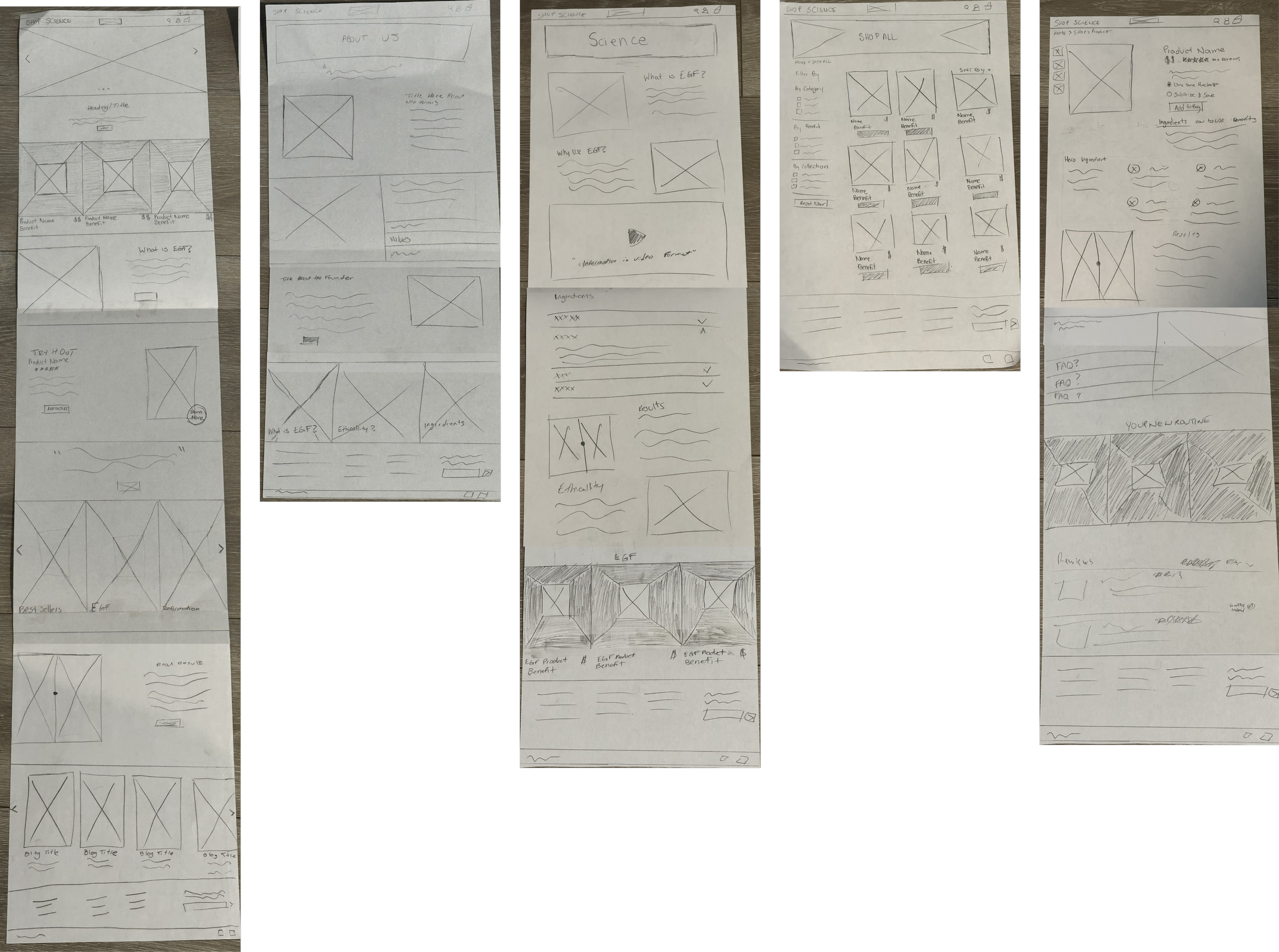
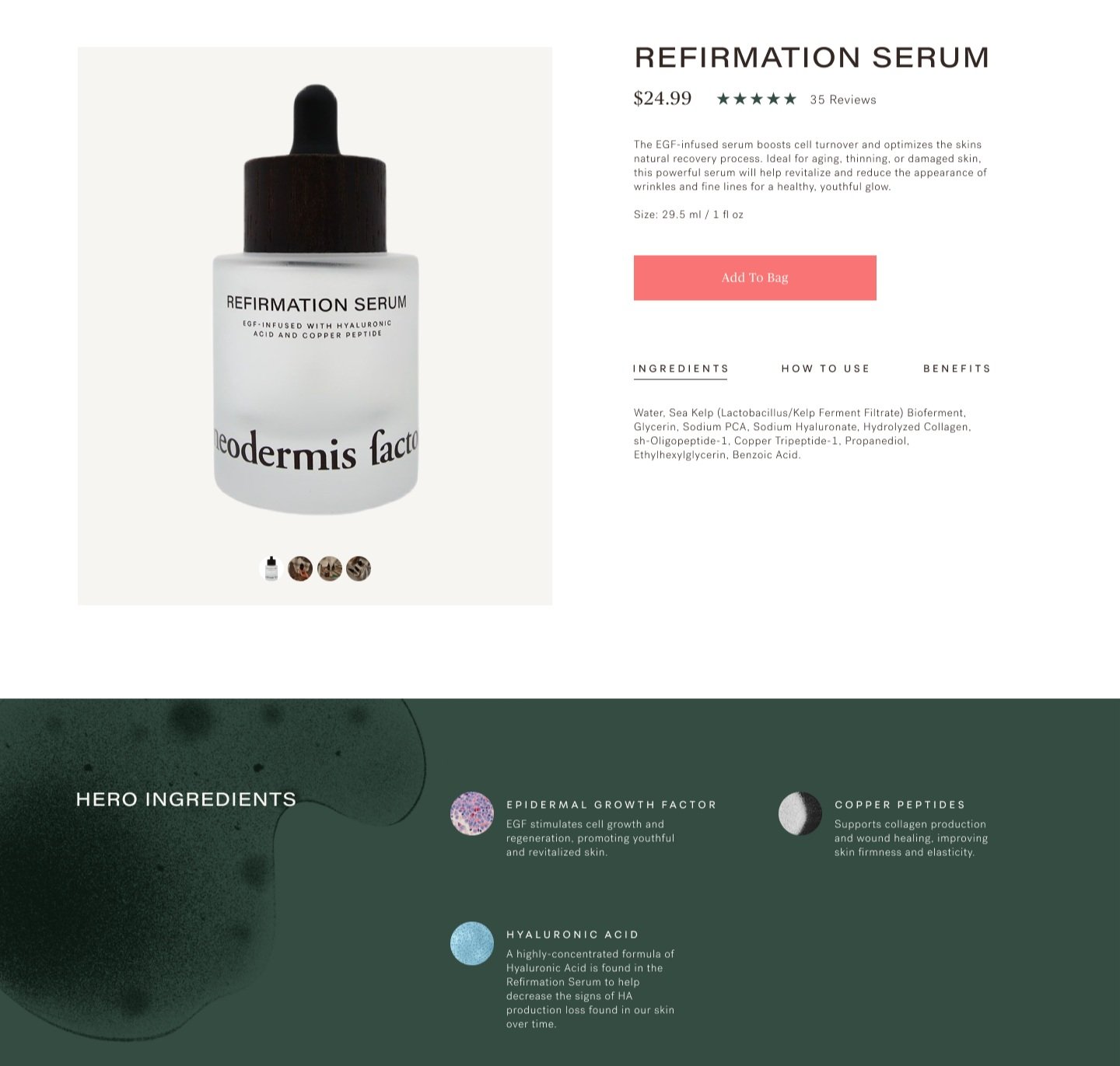
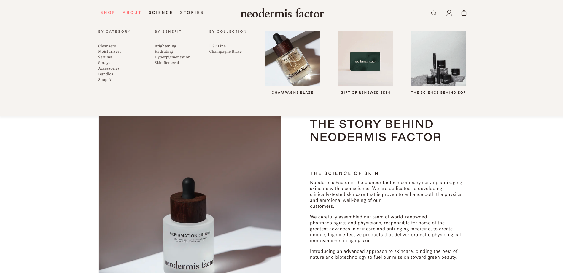
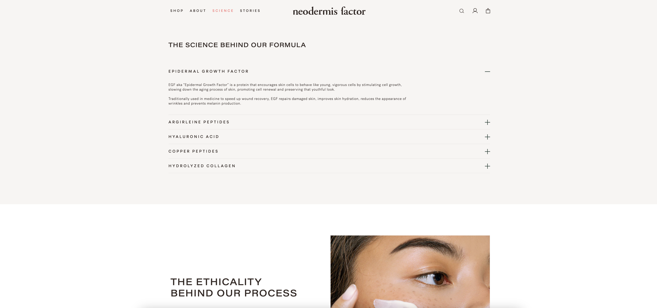
Following the research phase of our sprint, I emphasized the need to narrow our focus to key pages within a limited scope of work. The user flow chart proved invaluable in this decision-making process, helping me identify the user's "happy journey" and potential drop-off points. I prioritized wireframing for the home, about page (with a focus on SEO and information), science page, shop all page (for filtering purposes), interior blog page (for press and informative reasons), and product detail page. During the high-fidelity mockup phase, I would focus specifically on the home, about, science, and product detail page designs.
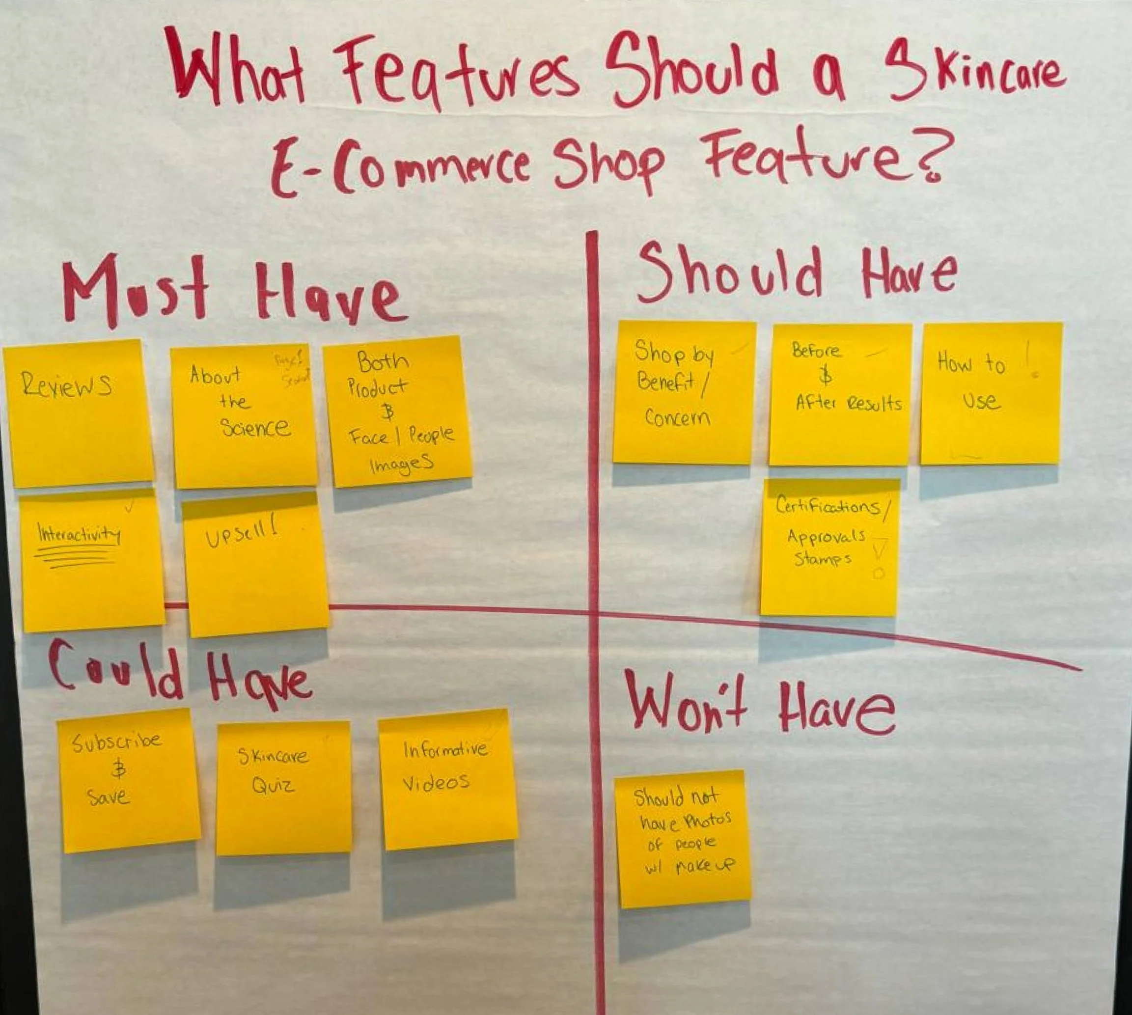
mscw method
Similarly to determining which pages to design, it was crucial to define the sections and features the website would incorporate. I assembled the same team that assisted in brainstorming user perspectives within the web space for this industry. Employing the MSCW method provided a clear framework for what to include and what to omit.
Low-fidelity
While working on the wireframes, I made sure the home page offered a smooth user experience right from the start. It was crucial to arrange sections in a way that feels natural, providing users with both information and easy access to products. Even though the about page wasn't initially part of the user flow chart, I decided to include it to improve SEO searchability and provide essential information to visitors. Redirecting them to the "happy path" from this page seemed like a smart move. The science page wireframe aims to educate users about methodologies and ingredients while guiding them through their desired journey. Similarly, the shop all page wireframe focuses primarily on organizing filters within the site's structure for easy navigation. Finally, the product detail page wireframe goes beyond facilitating purchases; it serves as a comprehensive hub of information about the selected product, enriching the user's experience.
Mid-fidelity
In my mid-fidelity iterations, I carefully adjusted the page layouts and developed interactive prototypes to get ready for usability testing. This step was crucial in ensuring a smooth and intuitive user experience, paving the way for meaningful user feedback and ongoing improvements.
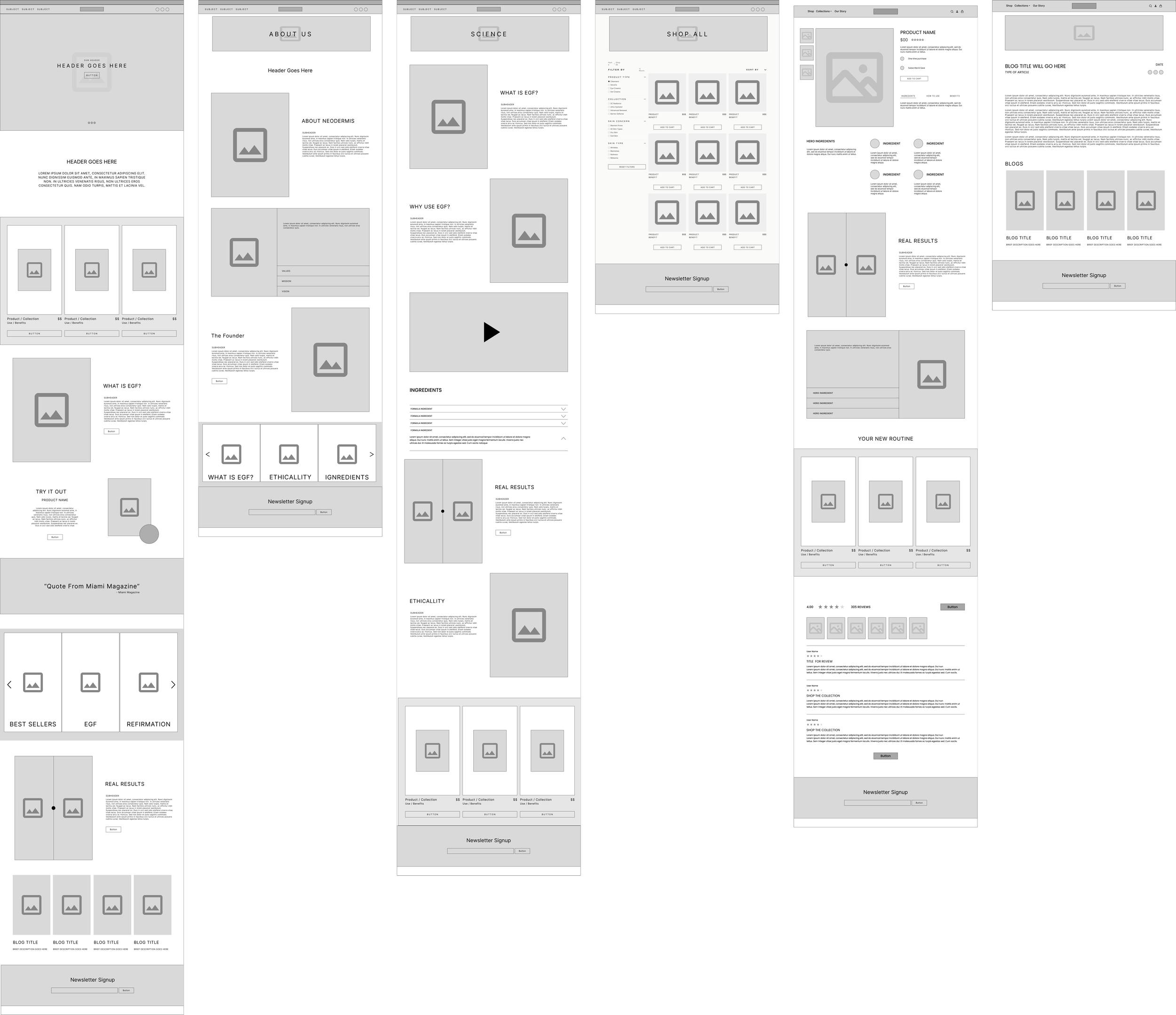
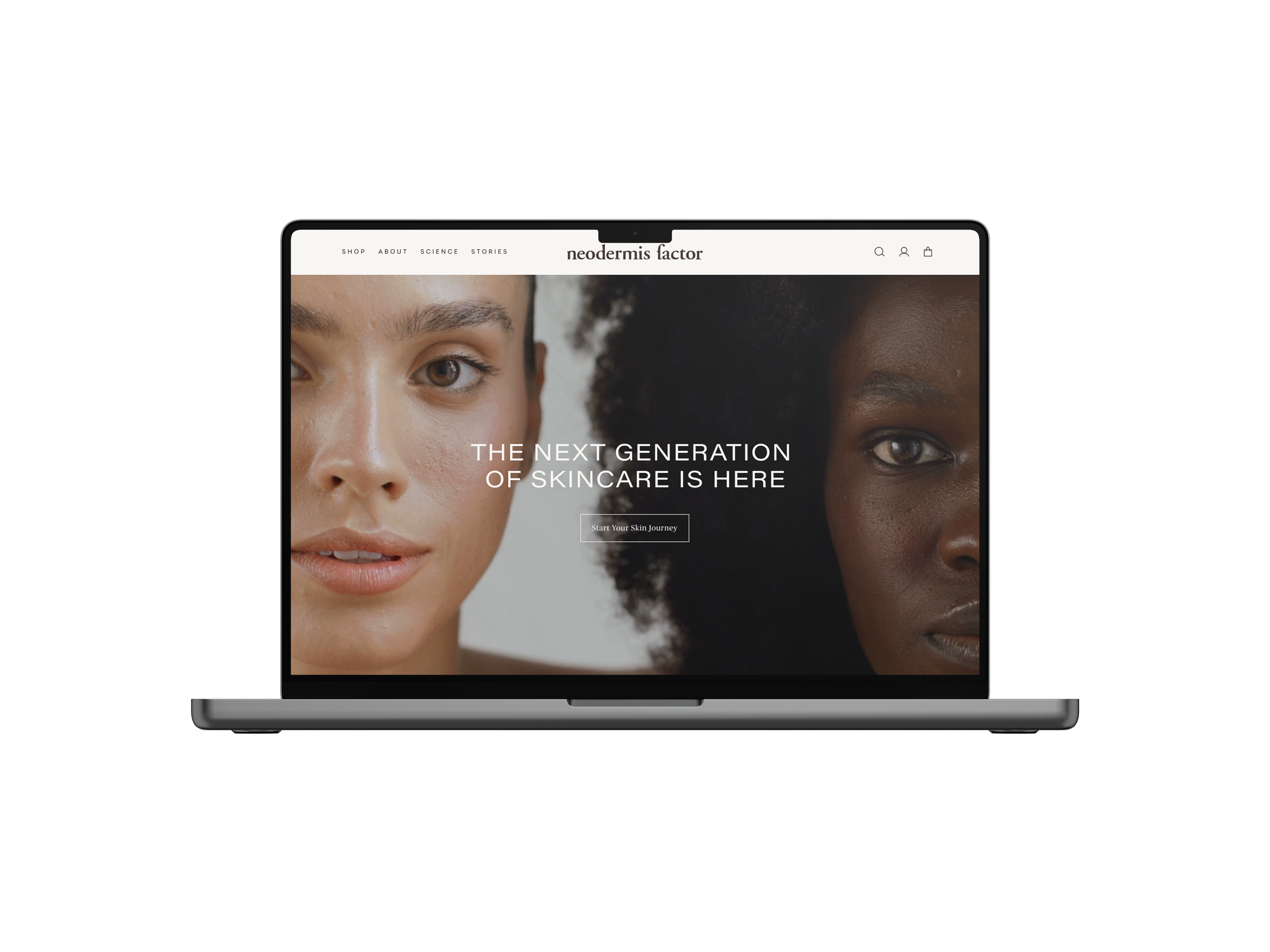
High-fidelity
In the final iteration, I incorporated a mega menu based on the feedback received from the usability testing participants. This created a more intuitive way for users to find the right product, addressing the issues highlighted and significantly improving the navigation experience. The design was then handed off to the client's developers, and we collaborated closely to bring the user experience to life. Even though only desktop mockups were in scope, I emphasized the importance of a great responsive product during the development phase. I worked with the developer to ensure the experience was seamless, regardless of the device the user was on.
→ Interact With Prototype
results
Takeways
After launching the redesigned website, we saw a significant improvement in traffic and conversions compared to the previous year. Average monthly visits jumped from 22 to 283, and sales nearly tripled.
The priority for this project was understanding why the original website design wasn't converting visitors into customers. To address this, we delved into the digital landscape of skincare products, analyzing how competitors and users fit into this ecosystem. We identified what Neodermis' competitors were doing right to draw influence from and areas where we could capitalize and improve. Given the short turnaround time, finding the right information quickly was crucial without an extensive research phase. Approaching the project with clear goals and problems to solve allowed us to be efficient and effective with our limited time.
With more time, I would have liked to conduct additional usability testing to ensure the solutions we implemented were optimal. Further development of the checkout experience and enhancing the user reviews section beyond the default Shopify plug-ins would also have been priorities for a more personalized design.